Logo Philosophy

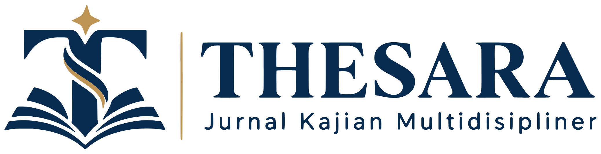
The THESARA logo consists of an emblem and a wordmark. The emblem combines the letter T, an open book, a gold ribbon, and a gold star in two colours: navy and gold.
The Letter T as a Pillar of Knowledge
The letter T, the initial of THESARA, stands upright at the centre of the emblem like a supporting pillar. It symbolises scholarly ideas that are clearly formulated, carefully tested, and accountable, and the steadfastness of academic integrity.
The Open Book: Knowledge Shared
The open pages of the book symbolise scholarly publication and the spirit of open access: knowledge is shared so that anyone can read, test, and build on it. The layered pages reflect the many fields of knowledge the journal brings together.
The Gold Ribbon: Flow Across Disciplines
The gold ribbon winding along the stem of the T depicts knowledge flowing across disciplinary boundaries, connecting ideas, methods, and findings into multidisciplinary scholarship.
The Gold Star: Excellence and Direction
The star at the top of the emblem stands for the pursuit of quality and academic excellence, and for the direction the journal takes: useful and impactful scholarship.
Navy and Gold
Navy conveys depth of knowledge, trust, and professionalism. Gold conveys value, excellence, and achievement.
The Wordmark
The name THESARA is set in a sturdy, classic serif typeface that reflects a credible academic tradition, and is separated from the emblem by a gold rule. Below it reads "Jurnal Kajian Multidisipliner".